Previously we wrote about how to choose a name. Now we have got that out of the way, it's time to put some visuals together that can better represent the brand you've just created. Keep in mind that whatever decisions you come to with regards to the overall appearance, these design elements will continue across all of your marketing materials, be they social media or your website.
Picking Your Colours
Your choice of colour will have a lasting effect on everything your brand does. This is because colour can define the emotional feel and help you to communicate much more than if your logo was in plain black and white. Make sure that your colour choice will separate you from your competition or it will only add unwanted confusion into the mix.
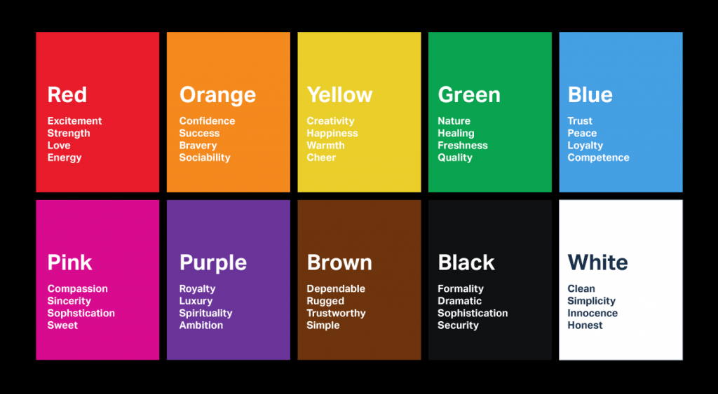
The science of colour psychology is far from an exact one. But these broad rules which you can see in these two charts do give a better indicator of the emotions triggered by associated with, certain colours. When it comes to choosing a colour for your logo, then take heed of how your audience will percieve the qualities of your business through the filter of colour.
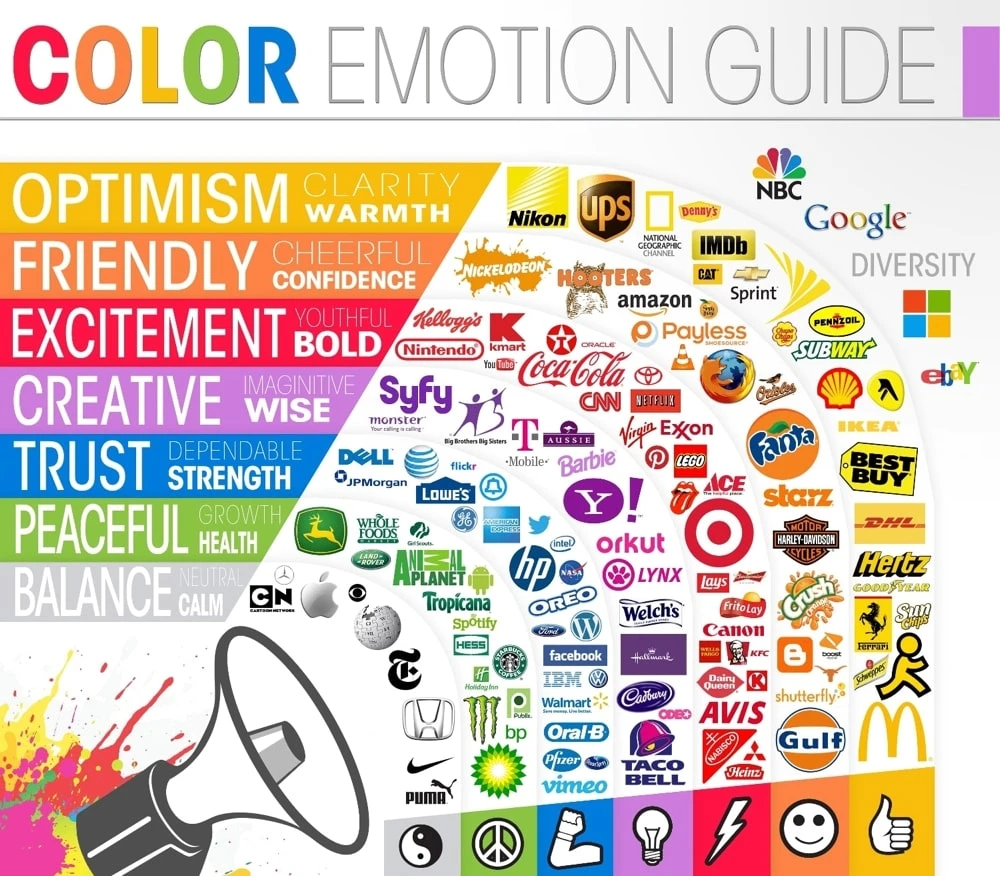
As you can see from these famous logos, you’ll need to consider how black and white text might appear over the colour you’re going with. Also, consider the reverse, with coloured text over a black and white base. The website Coolors is a fantastic resource if you’re looking to create a wonderful palette or simply want to juxtaposition different colours together to see their effect.
Choose a Font
Though you’re thinking about a font to represent your brand, you’ll need to consider how it will look on the web. In fact, all your design cues should have their look on the web as the most important aspect of your chioce. For the web, you’ll be needing two separate fonts. One for the headings and another for the text. In order to get a better grasp on all the fonts and how they look, go to Fontpair. It’s a community of typographers who are dedicated to providing open source fonts. Here you can browse a huge number of fonts and see how well they go together. If you want to see what your favourite websites are using in the form of fonts, then simply enter their URL into Stylify.me and you’ll be able to see just how they use fonts to make their logos and pages really jump out.
Let’s Design Your Logo
The logo is the company. Have no doubt that by creating a logo for a brand, the logo will represent all the potential within the business it fronts. Eventually, you’ll want your brand and it’s logo to become synonymous with all that’s good and promising in order to help make your products desirable and ensure they have a clean reputation. Your logo should be instantly identifiable. It needs to be unique so there’s no possibility of confusion among customers. It also needs to be scalable and function perfectly at all sizes. Not only for your Facebook page, but also as the tiny “favicon” you can see in the browser tab of most websites.
On the whole, having a text avatar doesn’t scale and so will be impossible for customers to read. If you can create an icon from the logo, then that will be recognizable at even the tiniest sizes. Below you’ll find examples of different logo types to give you some ideas about how fonts colours and design can convey certain aspects of your brand to their customers.
The Abstract: Google Chrome
![]() The great thing about having an abstract logo is that everything is open and you and the customer can decide the meaning.
The great thing about having an abstract logo is that everything is open and you and the customer can decide the meaning.
The Emblem: Starbucks
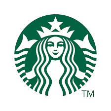 On the whole, most emblems are circular in shape. There’s often a combination of text and log, but be careful as they don’t scale as well, in particular if they're shrunk.
The Lettermark
![]() This is a way of turning the initials of your business into a logo.
This is a way of turning the initials of your business into a logo.
The Wordmark: Facebook
 This is the visual identity of your chosen name. As previously mentioned, be careful about scaling. Facebook gets around this problem by just using the first letter of their name as a separate icon.
The Mascot: Wendy’s
![]() A logo created from a mascot normally features a face of a representational character that embodies the company’s values. In this way they can serve to “humanise” your brand by creating a personality. Today we see less and less of this style of logo and it’s generally considered only useful on retro branding.
A logo created from a mascot normally features a face of a representational character that embodies the company’s values. In this way they can serve to “humanise” your brand by creating a personality. Today we see less and less of this style of logo and it’s generally considered only useful on retro branding.
The Icon: Twitter
 An icon should be thought of as a visual metaphor. The icon itself should express something about the business or product. If yours is a new brand, then you should stay away from icons, unless they are paired with a Wordmark.
The Combination: McDonald’s
![]() You’ll find that many logos are a combination of different styles. Depending on its use, the McDonald’s logo can simply be the double arch or the lettering on its own. This makes creating a scalable logo much easier.
You’ll find that many logos are a combination of different styles. Depending on its use, the McDonald’s logo can simply be the double arch or the lettering on its own. This makes creating a scalable logo much easier.
When it comes to actually sitting down and designing a logo, we suggest that you outsource. You’ll find a huge amount of very cheap talent on Fiverr. If you’re looking for inspiration, then be sure to check out Seek Logo to get the creative juices flowing. Finally, use the Hatchful Logo Maker to try out your own efforts.

